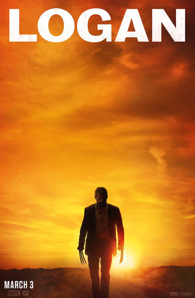
New ‘Logan’ Poster Shows Wolverine Going Full Cormac McCarthy
Don’t think it’s particularly revelatory to compare what we’ve seen of Logan so far to The Road. But, hey, fuck it. Sometimes the easiest comparison is the one you want to make.
t looks more like the cover of a Johnny Cash album than an X-Men movie. The title font itself features none of the shiny chrome effects of other X-Men movies of the past, and it’s not made up of a group of heroes stacked on top of each other via Photoshop. It honestly looks like the poster for a throwback western, except Wolverine’s claws are there to remind you who the main character is. Familiar faces like him and Professor X will be back, but the setting and mood are going to be entirely different.
There are also rumors floating around that a new trailer for the movie, hopefully showing us more of the actual plot, will be dropping in January, so stay tuned.


