‘WII U’ Gets Redesigned Tablet With Actual Analog Sticks. Go Figure!
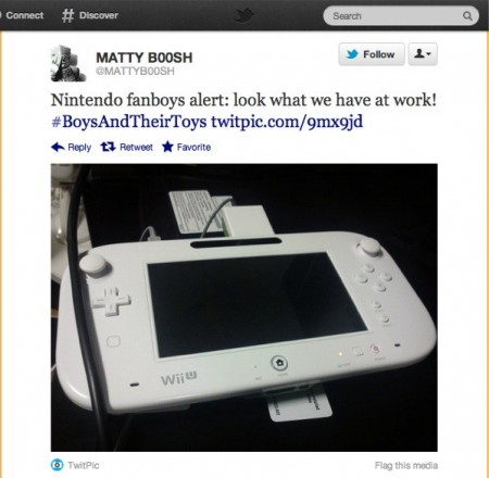
The Wii U’s totally-not-an-iPad-tablet-controller-tablet has gotten a redesign. We know this courtesy of some errant dude tweeting shit he shouldn’t be. Don’t ever change, everyone.
Joystiq:
A QA tester at TT Games (Lego Harry Potter, Lego Star Wars, et al.) has tweeted an image of a Wii U tablet that appears to have undergone a redesign since we saw one out in the wildduring last year’s E3, saying that the unit
Most importantly, the concave 3DS-esque circle pads have been replaced with Wii-style analog sticks. The Wii U logo has been moved to the bottom left-hand side of the unit, while the plus and minus buttons have been moved to the right. Two mysterious button-ish indentations exist below the d-pad and between the power button and battery life indicator; their function, if any, remains unclear. Click here for an omega hyper resolution version.
Update: Well that didn’t take long! The tweet in question has been removed, but a screenshot of said tweet has been safely ensconced after the break.
Additionally, eagle-eyed commenter Anthony noticed a couple more disparities between this unit and those seen at E3, namely that the Home button appears to be surrounded by an Xbox 360-style ring light, and that the tablet’s edges look more dramatically beveled than previously seen. We’ve also noticed that the gates surrounding the analog sticks are circular, rather than octagonal, as seen on the Wii Nunchuk and Classic Controller.


