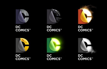
DC Officially Unveils ‘Secret Identity’ Logos. Still Awful.
DC has officially unveiled the “Secret Identity” logos that were leaked earlier this week courtesy of trademark filings. Oh! Now it all makes sense. The logo is “peeling away” to reveal the character’s identity and..and..vomit.
Hit the jump to behold them.
CBR:
After a trademark filing went public resulting in intense fan reaction and general curiosity from the comics industry, DC Entertainment saw the final take on its new logo hit the web today. Media and design websiteFast Company revealed the final version of a new mark for DC — one whose animated nature reveals a variety of effects, design elements and other colorful twists on the logo.
In the story, the site plays up secret identities and superpowers as the new visual cornerstone for DC Entertainment. The logo, which was reportedly in the works for nearly a year, will debut on comic book covers this March. On the heels of that will be a new DC Entertainment website which will focus on the company’s entire slate of media offerings, expanding beyond its comic publishing line.
“We didn’t want a static logo, but a living identity that could capture the power of our characters and storytelling,” DC SVP of franchise management Amit Desai said in the story. “What is special about DC content is the notion of a dual identity. When you think about our DC Comics superheroes, there’s a secret identity. When you think about Vertigo, it’s this notion of good vs. evil in many of the stories. And so, in addition to flexibility, the new logo communicates this idea of dual identity: There’s more than meets the eye. You have to take a closer look to understand the richness of our characters and stories.”
A year to design. A year.


