More Artwork of Robin From ‘Batman: Arkham City’ With Developer Comments.

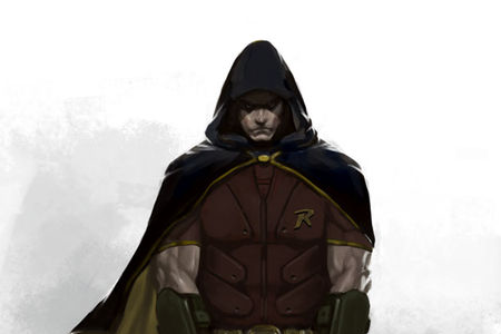
It was announced a couple of weeks ago that Robin was going to be thrown into Batman: Arkham City as a pre-order bonus. Said Robin was revealed, and he looked all sorts of brooding and angsty. The people. They were not pleased. Rocksteady Studios has released some more artwork of the Boy Wonder, and saw fit to explain their design choices as well.
Enlarge. | Via.
Daily Blam:
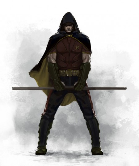
With some fans expressing concern over the appearance of Robin in the upcoming superhero sequel, Senior Concept Artist Kan Muftic has released the following remarks in an attempt to justify the character’s appearance, along with a colored piece of concept art for the image released last month.
“We wanted to create a Robin that players would identify as a contemporary character and move away from the traditional “Boy Wonder” image that most people know. Our vision of Robin is the one of a troubled young individual that is calm and introverted at times but very dangerous and aggressive if provoked.
“The shaved head is inspired by cage fighters, because we thought that Robin might be doing that in his spare time to keep him on his toes. Still, we kept all the classic trademarks of Robin’s appearance, such as the red and yellow colors of his outfit, the cape and the mask.
“We really hope that people will discover our Robin as one of their new favorite characters in the Batman universe. He is back and he means business.
Well there you go. It about fits the appearance. Generic troubled youth mixed with generic notions of Extreme ‘Cage Fighting’ for the win! For the! Win!


