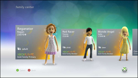
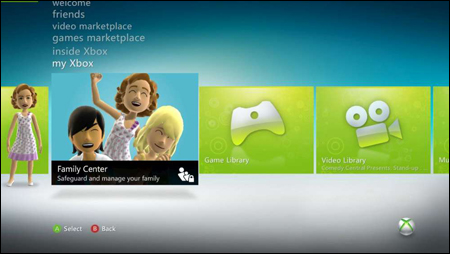
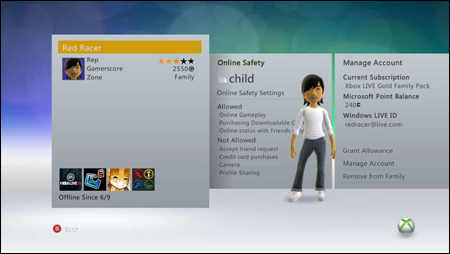
Xbox 360 Dashboard Is Getting A Redesign; Looks Almost Identical
Apparently the 360 dashboard is getting a redesign, soon? Tipped off by Logic Sunrise, Kotaku commented on it today. I have extremely undiscriminating eyes, and because of that, I struggled to figure out what exactly had changed. Thankfully the dudes at the K-Otaku spelled it out for me:
via kotaku:
The changes seen in the images include slightly smaller text for the menu options and presenting the sub menu as a series of side-by-side images rather than images that drop away from the screen.
Well, there you go! Are you satisfied? Hit the jump to get a bunch of new unthrilling pictures of the redesign.
—-
—-
Click images to get the omfg larger view.


